Decline's Drops
A downloadable Decline's Drops for Windows

in another Place, In another Time,
There lived, far away from everything, from everyone,
A small puppet made of oak and birch tree, hidden behind the forest.
Overview
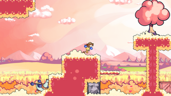
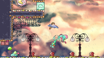
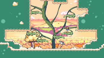
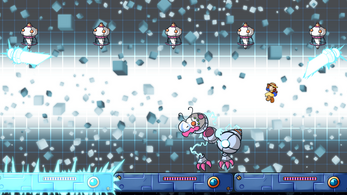
Decline's Drops is a beautiful hand-drawn 2D platform-brawler, in which you play as Globule, a wooden boxing-gloved Puppet who seeks revenge for her destroyed Garden. It brings the unique gameplay of famous platform-fighters (Super Smash Bros., Rivals of Aether…) and set in a solo colorful and melancholic adventure.
Each world, each character has been meticulously designed and crafted, made with love, passion, and care. Embracing the level design mastery of Yoshi's Island, DKC : Tropical Freeze, Kirby’s Adventure or Shovel Knight, Decline's Drops merges it with the satisfying gameplay of the Super Smash Bros. series in a solo focused adventure, full of chickens and frogs to punch, things to explore, and secrets to find!
Dive into 6 worlds, each one of them being a subtle satire of our own world. From the destruction of the environment to the exploitation of the animals, through the pollution of the seas and the impacts of high consumerism, Decline's Drops, without being a moral speech, has a lore focused on these different aspects of our modern society.
Features
✏️Discover a poetic, vibrant and somehow melancholic universe in an unexpected side-scrolling, hand-drawn adventure.
🥊Defend yourself with your powerful gloves using a wide range of attacks, allowing you to adapt to each and every situation.
⭐Travel through 6 beautiful hand-crafted worlds, each stage bringing unique ideas and environments.
🐍Avenge your garden by defeating all of the 6 Hydra heads and reveal the true reason behind the apparition of the Decline.
🐵Meet Serge, the engaging Genetically Modified Monkey. In exchange for precious « Drops », He'll grant you helpful tools to help you during your adventure !
🎵Incredible soundtrack crafted by ModalModule (Arcus Chroma, Legend of Kendor), accompanied by great SFX brought by Pixel Audio (Spiritfarer, Jotun, STAR WARS™: Squadrons…)
Grab your punching gloves, put your clogs on, it's time to SMASH.
| Status | Released |
| Platforms | Windows |
| Rating | Rated 4.7 out of 5 stars (50 total ratings) |
| Author | Drazglb. |
| Genre | Platformer, Action, Fighting |
| Made with | GameMaker |
| Tags | 2D, animated, brawler, Hand-drawn |
| Average session | A few minutes |
| Inputs | Keyboard, Xbox controller, Playstation controller |
| Accessibility | Subtitles |
Purchase
In order to download this Decline's Drops you must purchase it at or above the minimum price of $10.44 USD. You will get access to the following files:
Development log
- Decline's Drops V.1.1.5 live - Full Patch NotesJan 18, 2025
- DECLINE'S DROPS IS FINALLY OUT ON ITCH.IO!Dec 19, 2024
- One month till launch! Finally!Sep 10, 2024
- #3 KICKSTARTER 100% FUNDED IN ONE WEEK!Dec 01, 2020
- #2 Decline's Drops KICKSTARTER now LIVE!Nov 22, 2020
- #1 Ravage, Demo update and KickstarterNov 15, 2020

Comments
Log in with itch.io to leave a comment.
Could you update the itch version of the game, please? Just bought it here and noticed that it's missing the latest update.
Hey, thanks for getting Decline's Drops! There's quite a huge update coming very soon for both itch and Steam, which is why I haven't updated the itch version yet. My apologies for the long wait!
Nice, thank you for the reply! Amazing game!!
Does buying your game on Itch come with a Steam key?
Hello! No it doesn't, but you can run it on Steam by adding it to your Steam library.
Hi there! I'm using my PS5 DualSense controller plugged into my PC and, for some reason, I can't hold down the Jump button to jump higher; it only does the shortest possible jump. Using X on the keyboard works fine but not for the controller. I also tried this with the PS4 DualShock controller and the same thing happened.
Hello! Strange bug you have there, I'm using a PS4 DualShock too and it works fine. A friend of mine also tried with the PS5 DualSense (I don't have one sadly) and he said it worked fine too so I'll see what I can do but that's weird! Sorry this happened to you.
I appreciate your action!
I also experimented with remapping the gamepad controls. When I clicked on the Jump input, it immediately made the button L2 without waiting for a further input from me. I feel like the game might be registering the same button input twice for the X button on my DualSense?
Also, L2 tabs me out of the game.
Game massievly slows down when Scientist boss' start of 2nd phaze
maybe that black goop is problem?
Hey there, sorry this happened! I thought the problem was fixed already, but it seems it isn't... Actually the cause of this is the red background, I'll fix this in the next update, which should be live in the following days. Thank you for your patience!
Hi, as odd as this sounds I bought the game on itch, unzipped it, added it to steam library for steam input and now i can't play the game. it keeps saying "An error occurred while launching this game: No License" then i deleted the library profile but it keeps happening despite clicking directly on the file and not steam. is there a way i could have help with this? i would really like to try my purchase...
Hi,
This is a situation I didn't expected, and I may have a solution for you, I just need to make some small modifications before and it may take some time. I'm really sorry for the inconvenience caused!
I understand. thank you for responding! take all the time you need. also, for what its worth, good luck!
I'm getting the same issue.
Hi again, I just wanted to ask if that solution will be ready next month or some time after? (No pressure, i just wanted to ask)
Hello! I'm really really sorry for the long wait, I'm just adding a few bug fixes before I can publish a new version, but if I did things correctly this should be good next week or so.
I understand. Coding, debugging, testing and stuff takes a ton of time. Thanks for the reply. Good luck!
Hello! So I'm not sure this will work but normally the new update should fix your issue now! I hope it does anyway, please let me know! Thanks again for your patience!
For some reason, there's no option to buy the game
Hello! Sorry for the long wait, game is now finally available!
Thanks!
Can you update it release because it's here.
Finally updated, I'm sincerely sorry for the long wait!
Made a video for new demo on Steam
This was a fun game. The level and the Music were beautiful. The Graphic looked nice. The Boss in the end had the right difficulty. I recommend everyone on playing it. I made a video if someone is interested
Loved the Demo, can't wait for the full game
Oooh I lovw this game!! can't wait for the rest of the game to finish! it's a good game.
Thank you very much! I'll do my best so you can enjoy the full game!
Hey Spielpro, thanks for your awesome vid and nice comment! I really enjoyed watching you play Decline's Drops (and it also makes me realize how much the game has actually changed/improved since this demo, which is great too) and I really hope you'll like the final game! See you next time!
This game is incredible I absolutely like it the art style the music and the gameplay are all so unique and incredible I played this game in a random games video but overall I enjoyed this one.
It won't let me install it
Hello Drazglb! I LOVED your game! I made a review, but in portuguese XD
I hope full game launch soon! Good Luck in your Dev :3
Hey, thank you very much!!! Too bad I don't understand portuguese...!
Nice work! I'm a dev too, so I thought I'd check the game out.
I think I encountered a bug here:
The character was in the bottom-right corner, but when I jumped up to the roof, the camera bounds moved over to this other room with the boxes. Not sure if that was intentional or if the bounds of the box room was placed incorrectly.
One more thought: I like that you can't cancel your attacks into a parry, otherwise you could cheese the boss by parrying on reaction. However, because of this, it feels like the best strategy is to jab the boss instead of comboing. If you get locked in a combo when the boss attacks, you'll get hit, so it's safer to use individual attacks and wait for a chance to parry.
Could probably be fixed if the boss enters hitstun when you combo them - but you also don't want the player to button mash, either, so it's a little tricky. Just something to keep in mind.
Either way, great work so far!
Hey there, thank you very much for your feedback and bug report!
There's a ton of things that need to be improved regarding the combat system, and I have to find ways to force the players to vary their strategies. I noticed what you mention too and actually, it kind of applies to every enemy who has more than one HP, so I'm currently trying to find some solutions. One could be, for example, to add way more HPs to the enemies so the attacks can have more important differences in term of power, making it so the jab only is dealing minimum damages and used for reacting quickly. Another solution is, as you said, creating a hitstun state for enemies when they get combo'd, and I'm thinking about enemies that need you to perform specific attacks in order to get hit.
Thank you very much again!
gangco !???!? also everything else about this game!!!!???!
This is a very cool game. I love how you implement versatile verbs in the combat system.
Thanks a lot!
I think that you should make it so that you use WASD keys instead of the arrows thanks!
love the game can't wait for full release
[SPANISH REVIEW+GAMEPLAY ESPAÑOL]
This is an excellent game. It makes me very happy to see it grow and recieved support. I hope this video will be useful to make Declines Drops a little bit more public with hispanic gaming community.
I love to see the progress of the game, as well as the progress of my gameplay hehe.
Gameplay from 28 November 2020 - Game V 0.2
Gameplay from 11 September 2020 - Game V 0.1
sweet bg reminds me yoshi island some what here is my run no boss damage
hope see more bosses and skills
It is! I will do my best to improve the game feel . Thank you very much for this constructive playtest!
Made a video
As I said on Twitter, it was very fun to watch you play the new demo! Thanks a lot!
Hi Drazglb. I have played your game and I say that's a fenomenal work of art here. The graphics and the music are so gorgeous. I just loved every aspect of your work, I loved to play that and I took the chance to post on my channel.
Maybe the only problem here is the lack of more enemies, in my humble opinion. Despite that, I give you kudos for this beautiful game.
Hey, thank you for playing Decline's Drops! I'm so happy you enjoyed it.
I agree, there are not lots of enemies for now and the only one who has more than 1 HP is the chicken. This is something I'm working on and there will be lots of new and tougher enemies to fight in the final release, of course. For the next demo, you'll see more enemies too! Stay tuned =)
This is definitely a very neat and stylishly animated game, I love the concept and the art style. However, I don't know what current plans are like, but I'd warn against making too many bosses that are just big unflinching damage-sponges.
These sorts of bosses work for Smash because they provide a style of gameplay that every character can approach in the same way with less risk of bad matchups, where everyone's moves have the same effect (just do damage until you win) and everyone can avoid attacks with the generic dodge/shield/jump moves. But... because of this, they're too far separated from the standard gameplay, and somewhat homogenized. More of a fun sideshow than a culmination of the mechanics.
Since you don't have to work with this constraint, you should be able to make bosses that follow the mechanics of the rest of the game, and provide more satisfying "make use of what you've learned" challenges rather than basically making the player adapt to a whole separate playstyle for boss fights
Hi, first of all thank you for your kind message and your very useful feedback!
I'll be honest, I never thought about that problem. While I do have many ideas for the bosses, I must admit the way you fight them is indeed similar to the ones you fight in the Super Smash Bros. series, or the Shovel Knight bosses, to give another example.
It's actually a very good advice, and while the first boss is already done for the next demo (and I currently don't have the time to remake it), I'll definitely consider the question as I now think of many new possibilities. A huge, huge thank you for that.
I sincerely hope you'll enjoy what's coming next!
I really liked the demo.
✔️ Graphics - The overall look is cohesive. Very easy to the eyes. Beautiful. There are many ways to describe how good the graphics is. I like it very much. The screen transition is really cute as well, and I also liked its color palette.
✔️ Sound effects and music
✔️ Character movement and attack - Moves smoothly and I like the variety of attacks
✔️ Level design - I only played one level. I like the design because it wasn't monotonous or boring. It was fun exploring, collecting stuff and fighting the enemies.
Minor stuff:
The default controls are a bit odd for me though, WAD instead of ASD. But that's just a minor thing that can be fixed with customizable controls. And on the tutorial decals, W and A are switched.
Thank you very much for your message! I'm really happy you enjoyed the demo.
I added and fixed many things in the next update, and changed the controls for the gamepad. Keyboard controls will stay that way for now, customizable controls will come later but it will be in the final version, I promise!
It may just be a one stage demo for now, but Decline's Drops definitely shows potential. Quality character animations, fun visuals, chickens to punch, and a good kick of nostalgia. It's a good time and I'm curious to see what comes next.
Good job, dev.As I said on Twitter, really enjoyed watching your playthrough and your voice is really nice! Thak you for playing my game, hope you'll like what's coming next.
I am play game.
I love game.
the controls of the game were difficult. (Pc)
But the game was good.
I wrote this article with translate. may be wrong.
basically my thoughts as well.
Thank you very much, I really appreciate it. Customizable controls will come later, but I changed the gamepad default mapping for the next demo.
Absolutely loved this game. Played it on stream with a friend and enjoyed the aesthetic, art, sound, and gameplay. Love to see what it becomes. Brilliant game that gives off "Lesbian Cottagecore Sonic" vibes.
"Lesbian Cottagecore Sonic" I love it. Thank you for that comment, and very glad you enjoyed the demo!
It took me a while to find all the drops, but it was worth it (despite the lack of a payoff), especially since the theme of this game resonated with me so much :D
Oh, thank you for playing my game! Next time, you'll obtain a reward, believe me!
Good to hear; the completion of this game about a puppet who wants to restore her garden will be the greatest gift you can give to your fans, including me :D
amazing vibe you got going on there! Keep up the good work :)
Thank you very much!
i think it would be better to have the glove sign say keep running or a small animation of them running and then transforming
You're right, and it's something I just fixed!
Very relaxing game!
I think the frog boss fight's hit box could be more accurate (on the tongue fist attack). The game could also be harder. Nevertheless, a fun game!
Thank you!
You're right, I'll fix this in the next demo.
Also this is the very first stage, so I don't want it to be too hard. But don't worry, I'll spice things up later!
Thanks a lot!!
I wish I could draw like you, so I could make my dream game. Any tips on drawing??
Hi , thank you very much, I really appreciate it! I'll answer to both of your questions.
The game is planned to be released on the end of 2021, probably early 2022.
As for drawing tips... Well, to me there's only one rule: training. Train a lot, stay focused, and over everything have fun even if it's hard!
What a cool, good looking and fun game! Didn't play it, but the demo is amazing. When will it be completely done??
Weird question but what did you use to make the visuals for your game? I would assume that the character animations were made in adobe animate (as that's the only form of vector graphics GMS2 supports in sprites besides Spine), but if you wouldn't mind I'd like to know just a bit more about your method (especially in regards to environments), speaking as a fellow GMS user who wants to avoid ye olde pixel graphics artstyle.
Obviously you don't have to answer if it would be too revealing in regards to your work methods.
Hi there! There's no reason I wouldn't reveal how I work ^^! Actually everything is hand-drawn frame by frame and I use Clip Studio Paint Pro EX. I export the animations as PNG files directly in Game Maker Studio 2. Same goes for the backgrounds. Hope you find this useful for your next project!
Wait, if that's the case then how did you manage to keep the image from being butchered in windowed mode, when it's in lower resolution? Obviously the character sprite is lower res and you can see the pixels but like, damn, that's a smooth transition for a bitmap!
Well, you can thank Pixelated Pope for the amazing tutorial he did about keeping aspect ratio and cameras! I made my own camera based on these tutorials: